
Rainier Display is ambitious, tenacious, and evocative. We are a division of Rainier Industries, specializing in large format printing, branded environments, experiential marketing, and retail displays. In our 140,000 square foot facility in Seattle, we have the freedom to execute diverse projects by leveraging our wide variety of manufacturing capabilities.
Founded in 1896, our company continues to build on experience and legacy to expand our design, engineering, and manufacturing competencies for a diverse collection of customers and a wide variety of project types. At Rainier Display, we take pride in our ability to take on large company projects and custom one-offs alike. Most importantly, we are committed to our values and always put our customers first.

We are the bringers-to-life of the imagination. We are the designers, the engineers and the builders. We capture the idea, activate the concept and construct the vision.
Whatever inspires the heart, mind and soul, we make it real.
Our creations tell the story of the place in which they reside. Meant to affect, engage and excite, every project is unique and custom-made for those who will experience it.
At the intersection of creativity, engineering and manufacturing is where we thrive.
A division of Rainier Industries, established in 1896, Rainier Display juxtaposes our centenary legacy with the possibilities and promise of the future. As we have matured, the pledge to our core values,
performance and purpose remain. Looking forward, we mobilize leading-edge design, state-of-the-art technology and unique manufacturing methods to bring our clients’ vision to existence.
While we are always pioneering, inventing and exploring, we never forget who we are and where we came from.

Elegant or edgy, pristine or punk, sleek or structural... there are almost no limits to what we can do.
What we create, on behalf of our customers, is meant to evoke emotion, spark joy and amplify wonder. Experiences and environments that make an impact, leave a mark, shape a memory. From the creative minds and hearts of our artists, to the inventiveness of our engineers and precision of our manufacturers, Rainier Display works to excite the mind, arouse the soul and stimulate the imagination of those who experience our work.
And we have a lot of fun doing it.
The abstract nature of the mark is based on our ability to be creative and evoke new and innovative ideas.
The lowercase “r” and “d” represent Rainier Display without being literal.
Overlapping the shapes gives you a mark that is intriguing and memorable.
The opacity on the “d” shows that we are transparent with our customers and we work hard to put the customer first.
The harmony between the shapes is an example of how all our different departments work together, to become one united front on a project.
While the division title (Display) is at the forefront of this design, we also want to show pride in the Rainier legacy that we uphold each day.

The abstract nature of the mark is based on our ability to be creative and evoke new and innovative ideas.
The opacity on the “d” shows that we are transparent with our customers and we work hard to put the customer first.
The lowercase “r” and “d” represent Rainier Display without being literal.
The harmony between the shapes is an example of how all our different departments work together, to become one united front on a project.
Overlapping the shapes gives you a mark that is intriguing and memorable.
While the division title (Display) is at the forefront of this design, we also want to show pride in the Rainier legacy that we are upholding each day.


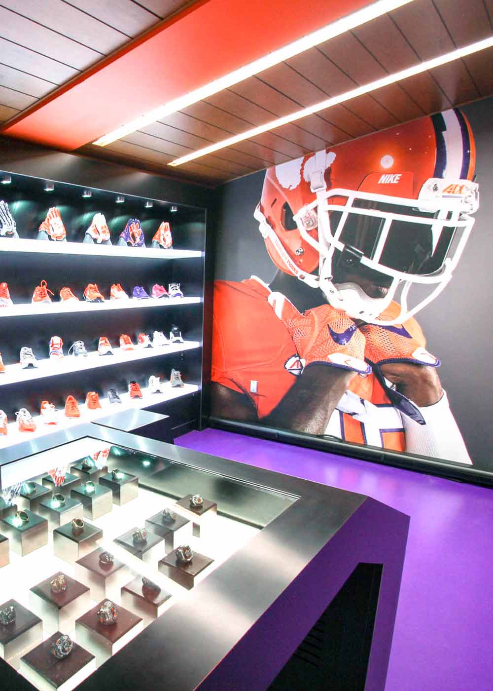
When adding stylized filters to our images, we only want to use this “yellow tinting” version of the Cinematic Filter for instances that are not outlining details of a client project. It can be an image from a project, but it must be used in a display or ad fashion. This filter is a great complimentary element to our color palette, and can help enhance our brand identity. This filter must be used sparingly and in special circumstances.
Examples of where it would be used:
- Header image on the website
- Accent image on print collateral
- The main article image in an email
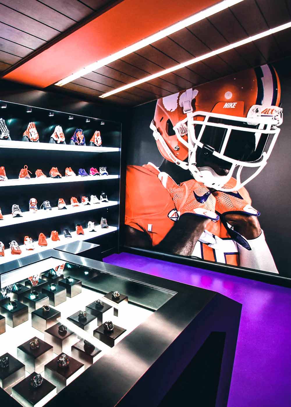
When outlining how we will stylize project images to be displayed on project pages in our portfolio, we need to make sure that the projects look impressive, professional and in sync with our brand; but also keep them true to color. This filter helps us achieve the intensity and polished look that our brand represents, but also keeps the image gallery true to color for showing the final product.
Examples of where it would be used:
- Project Portfolio Pages
- Slide Deck Presentations
- Client Meetings
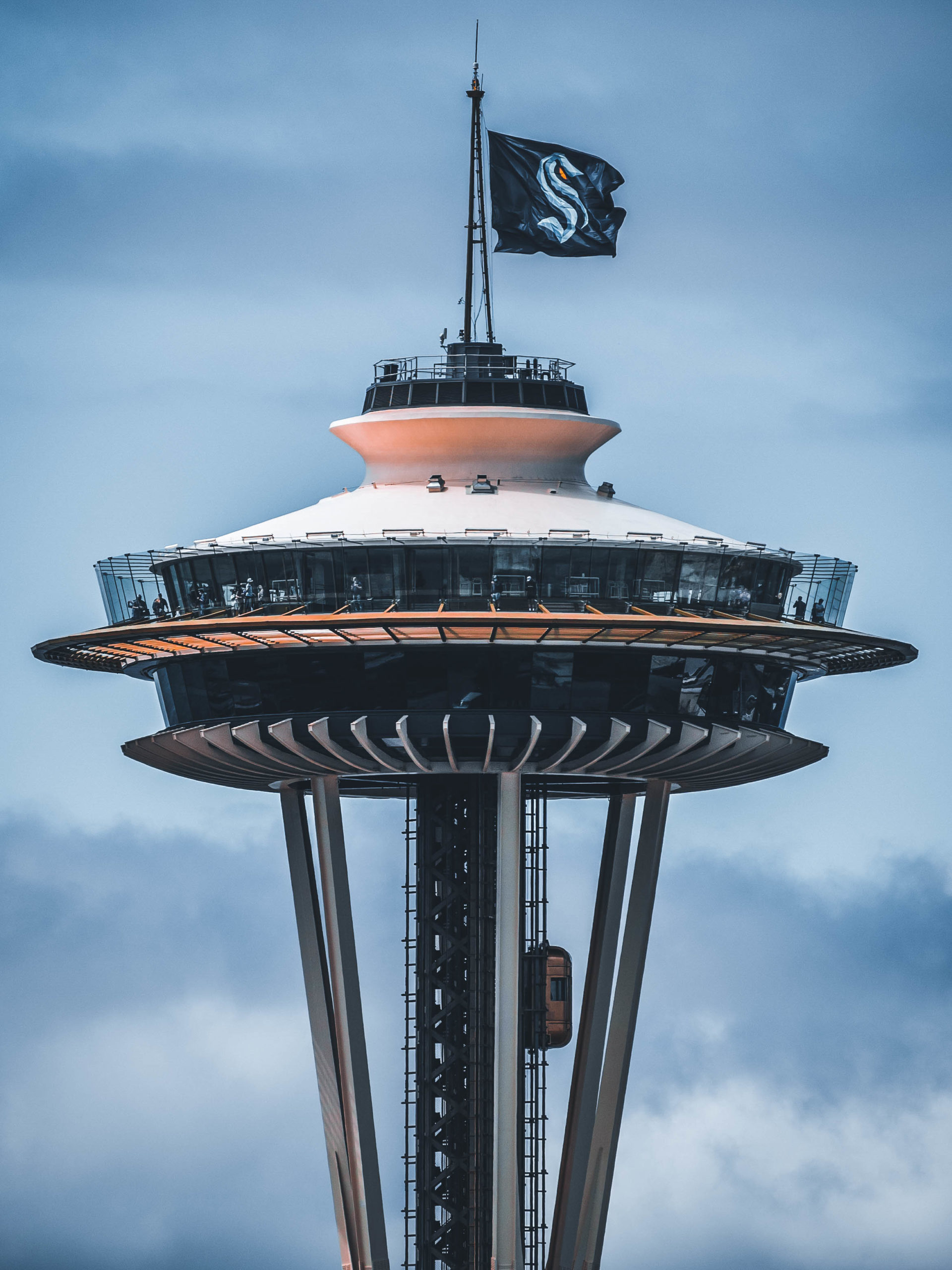
Go to RainierDisplay.com to see our recent projects, our innovative solutions and our team! See details about a wide variety of projects from the Seattle Space Needle flags to Bethesda gaming exhibitions. We hope that you keep us in mind for any and all sized projects moving forward.
When using our logos and assets, please follow the attached guidelines. Brand consistency is very important to us. Thank you for your interest in Rainier Display.